Our Thumbprints
making our mark
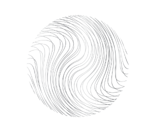
Our brand is more than a logo. It’s more than fonts, colors or anything we could create. Our brand, at its core, is the experience every patient has when they walk through our doors. We strive to provide the best in patient care – and that’s exactly what we do. At our core is a shared sense of humanity. That’s why we’re calling these elements of our brand the “thumbprints.” Because who we are is more than a brand– it’s the care and passion in our DNA.

Thumbprint Use Examples
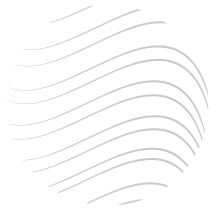
When using any of our thumbprints, be sure to crop in a way that does not isolate small lines or look abruptly cut off. This includes not leaving any sharp edges.
Thumbprints may be used in rectangular, spherical or fill applications as pictured to the right. Elements may also be used in gradient format as pictured below.
